Quantcast
Channel: Thomas Jefferson Kitts | Blog
Viewing all 171 articles
Browse latest View live

Tripping the Light Fantastic...

$
0
0
Dear blog readers:

A few weeks ago I asked for topics you would like to see in my upcoming book. And here is one I thought would be helpful to answer here, before I roll it into my book.

I am trying hard to figure out what makes an entire plein air painting look like it is bathed in the same light. Morning [and] sunset-paintings that so nicely convey that sense of light and time of day, I marvel at. It must be the typical bugaboos of value and chroma involved, and I'm finding I get the darkness of a passage confused with the chroma, like it should be dark and dull-colored, instead of dark and high-chroma. 
Thanks for your helpful blog, 
Judy P.

Judy, you are welcome. And thank you for framing such a great question. Unified light is something I will discuss in my book, but here a brief answer which may help right now.

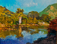
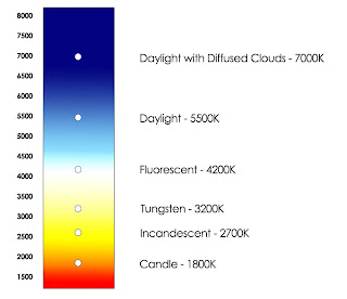
A single light source (natural or not) will illuminate what we see with a unified color temperature. Measurably, in the case of the sun on a clear morning, the light is normally pinker than it is later in the day. Fashion photographers who shoot outdoors tend to favor morning light because the temperature is so kind to the skin of a model. On a clear day, the light at noon reads at about 5500K, which is a bluer light. As the sun sets into the west – assuming nothing else is affecting the temperature of the light – the landscape will shift towards the red, and then the orange – that golden glow we love so much. 

That part is pretty straight-forward.


But there is something else involved beside the external measurable temperature of the light. There is a color effect that occurs within our eyes and brain. For a perceptual painter, there are two kinds of color: color which can be measured with an instrument, and color as how we experience it.

If a subject is illuminated by a warm light source the colors found in the shadows will appear cooler in comparison. This internal effect is related to the Law of Contrast of Color, as first explained by the 19th century French chemist Michel Eugene Chevreul. (To whom we owe the theories and art of the French Impressionists.) Outdoors, a cool dark can be accentuated by cool light bouncing in from the sky, but the shadows are not dependent upon it – the Law of Contrast of Color means the color receptors in your eyes are trying to balance out what is being perceived as warm with cool.

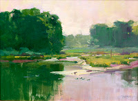
Interestingly, the reverse hold true: If instead, the temperature of the primary light source is cool then the colors in the shadows will appear more warm. The inverse of what you just read. You can experience this effect yourself by going outside on an overcast day. If it is winter, don't peek out a window. Go outside and let your eyes adjust. Otherwise you won't see it.

When we, as painters, disrupt this natural warm/cool division with a bad color mix we fail to convey the totality of the light. It is easy to disrupt this division because shadows are inherently more neutral than lights, and thus more easily mishandled.

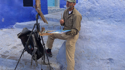
Of course, even when we succeed at organizing the temperatures in our paintings into warm and cool groups, expressing the light that bounces into the shadows remains essential to the total effect.  Reflected light can make determining the primary warm and cool relationship more difficult, but when we paint from life we can see such things as exceptions to the larger rule. One of the best arguments I know against painting from a photograph is how it tends to homogenize subtle temperature shifts. 

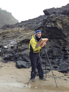
This is why I prefer to paint from life. I've found that if I do then all I have to do is mix what I see and the light works out.

Thomas

__________

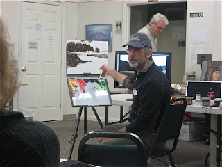
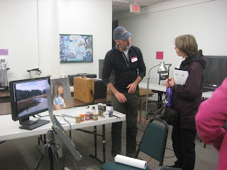
A notice of upcoming workshops:

I am offering two 3-day indoor winter workshops on January 25 - 27 and March 1-3.  (F/S/Sun)
The first one will be held in Roseburg, Oregon, the second in Portland, Oregon. (Both are accepting registrations now.)  
These classes will focus on Essential Alla Prima Painting Techniques and the Direct Method of Oil Painting. 
I have been asked to teach this spring in Carmel, California, at the Carmel Art Institute. Before or after the2nd Annual Plein Air Conference & Expo. Details will be announced as dates are set.
Pleaseemail me if you are interested in signing up for a class.


Announcing a 3-day Plein Air Workshop in Carmel, after the 2nd Annual Plein Air Convention & Expo...

$
0
0


This April 15th - 17th, 2013, I will be teaching a three-day
plein air workshop in the Monterey & Carmel, California, in conjunction with the Carmel Art Institute.

My workshop will begin the morning after the 2nd Annual Plein Air Convention & Expo

Now you can attend the world's largest and most informative plein air convention in the world, spend quality time with your painting buddies (plus make new ones), and rub elbows with plein air painters you admire. Then, after the Expo you can hop over to Carmel and jump into my plein air intensive to learn in-the-field tips and tricks, and receive one-on-one instruction, with plenty of time to paint along one of the most beautiful coastlines in the world. 

There is much we will cover in our three days of painting. You may go home tired, but you will be a more advanced and confident painter!


You can register via the Carmel Art Institute here:

http://carmelartinstitute.com/essential-alla-prima-plein-air-techniques


Here are the details:

Essential Alla Prima Plein Air Techniques 

Instructor: Thomas Jefferson Kitts 

Medium: Oil Paint
Course Meets: April 15 , 16, 17
Class times: 8:30 am-5:00 pm
Tuition: $390
Level: All Levels 


Learn to paint en plein air, in oils, in the most direct way possible using outdoor alla prima techniques developed by Sargent, Sorolla, and Zorn. Learn to paint quickly and with confidence so you can capture the fleeting effects of light and atmosphere. Thomas will offer on-site demonstrations and personalized instruction that will focus on how to simplify what you see. Thomas will also teach ways to rapidly establish a value structure, how to mix and control your color, how to paint from thin to thick, and when to add your finishing touches of bravura brushwork. For more information about Thomas’ approach to teaching, visit:

http://www.thomaskitts.blogspot.com/p/teaching-philosophy.html


Winner of the 2011 Carmel Art Festival (shown above), Thomas prefers to paint from life for its honesty and immediacy, and for those special moments when nature reveals herself.

Thomas is a member of the Laguna Beach Plein Air Painters Association, the California Art Club, the Oil Painters of America, and the American Impressionist Society. He travels extensively and maintains an active and distinguished exhibition history – one which includes the Laguna Art Museum, the Maritime Museum of Curacao, the Academy Museum of Art in Easton, Maryland, several Oil Painters of America’s National & Regional Exhibitions, Arts for the Parks Top 100, and three international New York Art Expos. Thomas’ work is widely collected throughout North America.


I am a Raymar Art Competition Finalist for November 2012...

$
0
0
Neat. I've just found out I'm a November finalist in the 6th Annual Raymar Fine Art Competition.

November was juried by Jill Carver and I feel doubly-honored because I've been an admirer of her work for a long time. Colorado painter Josh Elliot received this month's Best of Show for his painting, "Floating Gold", and there are many other outstanding works called out as well, with Randall Sexton and Josh Clare being two painters I know personally. The other artists I hope to meet someday.


And here is my painting:


"Peonies & Ginger Jar" 
oil on canvas | 20 x 24 inches | painted from life
November Raymar Finalist


From the Raymar Fine Art Competition website: 
Judge's Comments:Thomas cleverly utilizes a rich saturated background to accentuate the beautiful pale subtlety of the peonies. The round red and green objects in the foreground playfully repeat the colors in the background and in the posy. I love the small peony bud at the top-right; how it too mimics the round objects in the foreground; cover it up with your hand and somehow the flow is not quite the same is it? It’s a very cleverly orchestrated riot of color, each section having some dialogue with another piece of the arrangement. Note how he has tempered the saturation of rich color on the left-hand side with nice shadows and warm neutrals that continue and repeat from the cloth all the way up into the petals. Just gorgeous! - Jill Carver

It was executed as an intimate demo for two of my more advanced students. Primarily to show how composing a painting can be organic – and that when we paint from life it is not necessary to always pre-plan or work out everything to the 'nth' detail before jumping in. Many times we can just wing it. I wanted my students to understand they can can the eye by choosing a major wending line to develop, and how modifying a few existing values can push a structural element in or out of the pictorial plane, and how chroma, shape, and paint thickness can be used to harmoniously rebalance an asymmetrical arrangement. (Most of which was articulated nicely by Jill Carver in her excellent summary.) 

"Peonies & Ginger Jar" was painted alla prima, and largely completed within a few hours. It just came home from the 2012 American Impressionists Society's National Juried Exhibition last week and it now hangs above my fireplace, above my wife's nativity cresche scene. The red in the background looks festive with our holiday decor.

This means I now have a total of three paintings juried into Raymar's 2011-2012 competition, up for one final round of consideration. Here are the two others...


"The Sentinel"
16 x 20 inches | oil on linen | painted en plein air
December Raymar Judge: John Burton
Painted during the Laguna Beach Plein Air Invitational | Sold


"A New Dawn, A New Day"
16 x 20 | oil on canvas | painted en plein air
July Raymar Judge: Jennifer McChristian
Painted during Easton Plein Air | Sold


C.W. Mundy, another observational painter I greatly admire, will be the final juror for the contest. He will make his decisions in January. He has a total of 144 paintings to consider, and twelve awards and recognitions to hand out. Which is one heck of a lot of outstanding art to work through. So if I don't get any further than being a 3x finalist this year, that's okay. I'm fine. Because I know I s in good company.

Thomas

_______

Reminder: I have three oil painting workshops lined up over the next few months and you can register for any of them now. But don't wait too long to do so as the first two are filling soon...

Essential Alla Prima Techniques | January 25th - 27th, Umpqua Valley, Oregon
(This workshop will be taught solvent-free. If you ever wondered how to reduce your exposure then this is the class for you...)


Essential Alla Prima Techniques | March 1st - 3rd, Portland, Oregon
(A great primer for anyone interested in plein air painting. Learn how to work wet-into-wet oil paint without the stress and pressure of moving light...)

Essential Alla Prima Plein Air Techniques | April 15th -17, Carmel, California
(Along the Big Sur and Monterey coastline, and in conjunction with the Carmel Art Institute)

If you have a question about any of these workshops just send me an email. I will be happy to respond.


Geeking out...

$
0
0

Yes, it is a kitten. After the night I just had I needed to see one on 'te internets'...


Okay, I admit it. I am a painting geek. And as they say, "Once a geek, always a geek." 

I like to learn about arcane painting methods and materials. And about arcane painters and art movements as well. That stuff fascinates me. But man, I hate computers. Or I should say, I have a love/hate relationship with computers.

Which means I love to hate computers.

There has been some back room changes in how Google and Yahoo handle domain redirects, naked URLs, ANAME and CNAME records, and domain ownership verification (whatever the h*ll those things are...) and it made me pull an all-nighter to sort it out – something I haven't done since college over thirty years ago.

I sat down last night at 9:00 pm out to bring my online gallery and this blog under one roof. Accessible by a single domain. I did this because the readership of my blog has taken off in unexpected ways and I am anticipating another significant uptick in traffic in the next few weeks. (I'll explain why soon...) So changes had to be made. I thought I was going to sit down at my laptop with a glass of wine, open a couple of control panels, click a few buttons, and be done.

Then I lost you. All of you. Apparently I checked or typed something that should not be touched and you all went away. (ARRRRG!) With no idea how to bring you back.

So if you clicked http://www.thomaskitts.com to visit my online gallery and unexpectedly landed here it's because I've been ignorantly fiddling around with a bunch of yoogly-googly control panels and reading obscure and conflicting tech notices even Bill Gates would struggle with. All because I inadvertently became the proverbial bull in a digital china shop last night. But now the pieces have been put back together. Humpty Dumpty will live for another day. If you want to visit my online gallery now click the "Online Gallery..." tab above. I hope this is clear and intuitive enough. Goodness knows it wasn't easy to patch together.

There are more tweaks coming down the pike but I think I'm finished with the dangerous stuff. What was once a teetering house of cards is now, well . . . er, still sort of a hodge-podge house of cards. But at least now everybody is coming in through the same door.

Did I mention I hate computers? I'm going to bed now. When I get up I am going to paint a kitten.


Here is a sneak peak at a 6-page article I wrote for the next issue of PleinAir Magazine...

$
0
0
The article is about the recent painting trip I took to Spain and Morocco last fall, and it went to press yesterday. If you subscribe to the print version of PleinAir Magazine you will see it in your mailbox during the first week of February. If you are a digital subscriber the article will appear online a bit earlier. The article will also be included in PleinAir Magazine's extended online content on OutdoorPainter.com and a teaser will be dropped into an upcoming PleinAir Today's email blast. 

Needless to say I am thrilled about this and want to thank the editor and publisher for their interest and support.

With the generous permission of PleinAir Magazine you may read an advanced copy of the article by downloading this pdf. Please feel free to share it with your friends. If you like this article, and want to read more about plein air painting, consider subscribing to the magazine. It is a fine way to learn about the great plein air painters of the past, and the top contemporary outdoor painters of today...


(The link will open a new window and load a file. If you wish to download the pdf click the black arrow in the upper left corner or use the google file menu in the same area.)
I have already posted a few things about the trip last fall but the article contains content held back for the magazine. It focuses on how to minimize gear, and includes a few extra street sketches, a short how-to, and a little taste of the adventure.

Once the magazine ships I'll post some more about the trip. Specifically, about the time I spent in Sorolla's home and studio in Madrid. (see left) The experience was both exhilarating and humbling.

But until then, I hope you enjoy this sneak peak of the article. If it prompts a question just post it in the comment area below and I will be happy to respond.

Thomas

____

Oh, and for any of you who are planning to attend the 2nd Annual Plein Air Convention & Expoin Monterey, California this April, I'll be presenting a demonstration for the attendees. Please stop and introduce yourself!


The Past is Now...

$
0
0
The more I learn about art history and painting, the more I realize there is nothing new under the sun. Which I find reassuring in this era of Post-Post-Modernism. (ummmm, Post-Everything?) Perhaps it is due to my age, or perhaps I have simply come to accept that there is something bigger to the thread of art than setting out to paint pretty pictures.

Here is a repost for your enjoyment about a current exhibition at the Metropolitan Museum of Art in New York City. It's a New York Times Art Review – with a link to the full article below. Click it if you want to read it all...

–––––––––––––––––––

ART REVIEW 
The Great Outdoors 
‘The Path of Nature,’ at the Metropolitan Museum of Art

Metropolitan Museum of Art, Whitney Collection

The Path of Nature Paul Flandrin’s “View of the Villa Torlonia, Frascati, at Dusk,” in this show at the Met.
By HOLLAND COTTER   | Published: January 24, 2013 
“Sparkle with repose” was the effect the British artist John Constable (1776-1837) said he strove for in his landscape paintings. His French contemporaries, following his lead, had the same idea. If success is measured by fame, Constable achieved his goal, and they didn’t. He’s a star. But León Pallière? Adrien Dauzats? Alexandre-Hyacinthe Dunouy? Only wonkish scholars are likely to know their names now. 
Lucky for them that one of those scholars is the collector and dealer Wheelock Whitney III, who has a passion for French art from the years between neo-Classicism and Romanticism, and a particular love for gleaming little oil sketches on paper done out of doors — en plein-air — in that time. For years he sought them out and bought them up. In 2003 he gave his pictures to the Metropolitan Museum of Art, where 50 of them make up the exhibition called “The Path of Nature: French Paintings From the Wheelock Whitney Collection, 1785-1850.” 
Although most of the artists are French, when you’re in the show, you’re in Italy. For northern European artists in the late 18th century that was the place to be, especially Rome and its environs. The allure was much the same as for tourists now: history, warmth, la dolce vita, and, for artists, a taste of creative freedom. In Paris painters plugged away in cramped studios mastering their craft by the book. If they hoped for acceptance into the career mills known as salons, that had to adhere to academic fashion. In the late 18th and early 19th centuries, with the Revolution succeeded by the reign of Napoleon, that meant history painting: magniloquent tableaus — battles, shipwrecks, coronations — in which myth and reality met. 
Once on the highway south, though, clear of Paris, away from schools and salons, artists could loosen up, relax, paint what they wanted. They carried their materials on their backs: brushes, pencils, paint, a portable easel and lots of paper. They set up their studios where they pleased, often outside, in a roadside grove of trees, on a rise overlooking a town, at the foot of a waterfall crashing down . . .


© 2013 The New York Times Company

Nicholai Fechin Exhibition . . .

$
0
0
The Fry Art Museum in Seattle, Washington will host an exhibition of paintings by Nicholai Fechin. This will be a brief presentation of work rarely seen in the Pacific Northwest. So put it on your calendar now!

Lady in Pink, Nicholai Fechin


Fechin preferred to paint with oil-starved color and used a dry-brush technique to create his rich surfaces of color.His abstract compositions and drawing skills were astonishing and he completely eschewed the use of any medium or solvent because he felt they destructive to the layering of color. It's hard to argue with that after seeing his work.

Here is a favorite quote from him because it explains my own point of view:
“As a matter of fact an artist has to deal with only three basic colors: red, blue, yellow (all the rest are combinations of these fundamental colors). Everyone knows this, but few pay attention to the fact. Thus, the first step for the artist is to learn to see these primary colors and to distinguish them separately one from the other.”   –  Nicolai Fechin
Of course, then there is:
"For my own work, I do not like to use medium. This dissolves the paints too much. The pigments mix together and cannot retain their individual distinctiveness and thus again lose much of their fresh intensity."
And finally:
"Any standardization is negative in its meaning. If conventional shades and colors are used, the ability to see them in reality is lost. It is essential that the artist should regard every new painting as an entirely special world of color, light, form and line. Every new canvas is a completely new challenge."

Truly a painter to inspire you!

–––––––––
From the Fry Art Museum website:
In 1911, place of honor in the Annual Winter Exhibition of the National Academy of Design in New York was assigned to a painting by thirty-year old Russian artist Nicolai Fechin (1881–1955). His “savage, splendid, and heterogeneous” canvas displayed a “barbaric mastery of form and color.” Fechin’s early preference for thick layers of color and pigment with very little oil, and a penchant for conflating the real and the abstract, would bring him international acclaim in the first decades of the 20th century . . . 
(click to continue reading on the Fry website)

–––––––––

So don't miss this opportunity to see Nicholai Fechin's "savage, splendid, and heterogeneous" work.He was a direct descendant of the 19th century Russian Itinerants (Передви́жники) who were some of Imperial Russia's greatest painters, among the best was the master artist Ilya Repin, whom Fechin studied under. Much of today's contemporary realism descends from this line.

I'll be going. Hope to see you there!

Thomas


Maui Plein Air Painting Invitational coming up...

$
0
0
For all you folks in the Islands who are looking forward to the 2013 February Maui Plein Air Painting Invitational here is a sneak peak at a small work I will be hanging in the midweek auction...


"Keaomelemele" (The Golden Cloud)
8 x 8 inches, on gallery-wrapped canvas
(click on image to enlarge...)

According to legend, Ke-ao-mele-mele was said to be the third born child of the Gods brought to the Paradise of the Pacific, Hawai'i. After returning to help her family, she was taught the hula by the God Kapo and became a kumu, a grand teacher of the dance herself.
I look forward to my arrival, breaking out the paints, and meeting all of you!

Mahalo,

Thomas

Winter Painting on the Oregon Coast.

$
0
0
I went down hard on my back last week with the flu so when I got back up again my wife and I blew out of town to spend the weekend at the beach.


All the way out here here and no further...

But yesterday, I couldn't get to the spot I wanted to paint due to unusually high winter tides. (In the above photo, I am at the far end of a hand cut tunnel that takes you to what is appropriately named, Tunnel Beach. The winter storms have stripped the beach and left a six foot drop onto basalt rock.  And yet the waves still came up to my boots. (This tunnel can completely fill up with water during bad weather.) I didn't feel like clambering down into the crashing waterline and wading out onto a sand bar to paint. Not yesterday, and not after last week. Well okay, I did consider it for about half a second but decided I'd be an idiot to do it on a 40 degree day in February after having just risen from the dead. (What a pansy...!). So instead I chose to paint from the parking lot before driving back home in Portland. Wasn't crazy about the finish in this clip, but still, it was better than not painting at all.


Oceanside, Oregon is a quaint little beach town which clings tenaciously to the south side of a 300 foot cliff. It is perfectly scooped to catch the winter storms like an open baseball mitt. People who live there year round batten themselves down when the winds kick up because they know what is coming. So Oceanside remains a piece of the old Oregon coast, a place which is getting harder and harder to find these days. The coast road ends at the town and there are only two places where you can get something to eat. (A nice egg-crab hollandaise scramble and fine cup of coffee, for example.) Oceanside is not a big tourist destination, which makes it my kind of place to chill out. While there, my wife and I watched a pod of Orcas stalk a couple of sea lion harems along the rocks. We also startled an owl, got glared at by a bald eagle, and annoyed some sleepy seagulls who just wanted to rest up after last week's storm. Oh, and we found a white Japanese fisherman's boot amid the rick rack on the beach. Hopefully the fisherman who wore it made it home safely. And bought a new right boot because this one had barnacles inside it and we won't be returning it.

I did get one little 8 x 10 panel off the night before on Tunnel beach of the pins and needles I drove out for, and I will post the sketch as soon as it has dried enough to lay on the scanner. Very monochromatic – mostly burnt sienna, viridian and white – which is how things look around here during winter. But starkly beautiful none the less. I like the composition I ended up with. Kinda Franz Kline- or Robert Motherwell-like in mood. I should do more.


Me, giving the pins and needles an evil squint after timing the tides correctly. Got a late start but knocked out a quick 30 minute sketch anyway. The secret tunnel I allude to cuts through the distant bluff behind me.


Next week: Maui, a contrast to Oregon. 

Can't wait for the sun...

---

Oh and there is now only one spot left in my upcoming March indoor Essential Alla Prima Painting Techniques workshop. If you want to join us let me know immediately. Otherwise I will start a waiting list Wednesday.


Article 0

$
0
0

Well, I'm off to the Maui Plein Air Painting Invitational.

Enjoy...


I'll try to post during the next two weeks.

Thomas

I'll be Speaking at the 2nd Annual Plein Air Convention & Expo next Month...

$
0
0
The 2nd Annual Plein Air Convention is coming up next month and I have been invited to be one of the event's early speakers. This is fine by me because it means I will get to show up, do my job, and kick back for rest of the event. Which translates to joining the painting parties early on and having some fun. (ha!)

I have been specifically asked by the publishers to talk about the plein air palette. So I'll talk about what colors are necessary, what colors are helpful, and what colors you can leave in the studio, if not on the shelf of the art store altogether. To avoid putting anyone to sleep I'll throw in some fun historical stuff about color, a little optical science, and lots of practical advice about mixing color in the quickest way possible – because IMHO, working quickly is essential when you are burning daylight.


The 'reduced' palette I took to Spain and Morocco.
Basically, it covered most of the spectrum with a few holes to work around...


Usually, the palette an artist develops is personal, often to the point of being idiosyncratic, and it is almost always in constant transition. So nothing I have to say about the outdoor palette will be along the lines of "you must have this color on it" or "you must not use that color". No, nothing like that at all. Rules suck and are seldom helpful in art so the principles I'll share will be time-tested and sound. You'll be able to apply them to your own color fetish.


Whoa there pardner, that's a lot of colors. Do you really need all that?

We will also have fun learning about Sargent's outdoor palette, Sorolla's outdoor palette, and Zorn's somewhat mythical reduced 4-color palette which has somehow achieved an exalted yet wishful status within the limited-palette crowd. (Hey folks, let me share a teaser: Zorn used blue, okay? Tubes of cobalt blue were found in his studio after his death. Plus, you can find it in his work. Don't believe everything your read on 'te internets'...)

But most importantly, we will focus on how to rapidly perceive and mix color on the fly. The most essential skill the outdoor painter can develop is the ability to recognize color without thinking about it. Whether you paint under the bright sun or under a looming cloud – or heck, in a bar – color is color.


Sargent's "Artist in the Studio"
Okay, so it's not en plein air but there is a beautiful palette in it!

Because, what every oil painter discovers the first time they drag their easel outdoors is that it isn't possible to capture the light they find there using paint – it's only possible to capture the effects of light using paint. This is an important distinction to make since only one is achievable. Therein lies the magic of a good outdoor palette. There really are a few tricks you can use...

I look forward to seeing you all at the Plein Air Convention.It will be a plein air flash mob but more. There will be good times, good friends, and some wonderful opportunities to learn something you didn't already know. Last year I picked up a sweet tip from Matt Smith from a throw away comment, and another about Sargent's watercolors from Richard Ormond, and there were others things as well. 

There are a few spaces left if you want in on the fun!

Thomas

–––––––

Oh, and click here if you want to sign up for my April 3-day Carmel Plein Air Workshop immediately after the convention. If you are in town, why not stay a few extra days and paint in one of the most breath-taking areas of the world? And work on your palette?


Training for Plein Air Easton...

$
0
0
This event is soooooo much fun...and we're only just lining up to get in!


If you can't see the video, go here: 

Thomas

––––


Next Plein Air Workshop will be April 15 -17, in Carmel, after the 2nd Annual Plein Air Convention & Expo in Monterey. Come to the convention, paint with the pros, and then enjoy a 3-day intensive in one of the most beautiful areas of the world. For more information or to register, click here...

20th Carmel Art Festival...

$
0
0
I will be off to the 20th Carmel Arts Festival again this May. I'm happy to be doing it again this year because it is such a stunning part of the world to paint, and this time, in addition to the usual suspects, there will be some new painters I have not met. Roos Schuring and Marc Dalessio, for example.

The Pacific Northwest will be well represented by Anton Pavlenko, Aimee Erickson, Greta Lindwood (who won People's Choice last year with the lovely pastel you see below), and myself.


This plein air event is unlike any other I do. The landscape itself is intense and exotic, and there is very little time to paint, making the competition a pressure-cooker. If you start off badly, or the weather goes south, it can be hard to recover.

But no matter what, Carmel and its environs are an awe-inspiring area to paint so be sure to track Anton, Aimee, Greta, and me on our blogs and Facebook to see how we do.

The Pacific Northwest rocks!...


Demos and Talks, Talks and Demos...

$
0
0
Last night's informal painting demonstration and talk at a painting group in Vancouver, Washington.

Normally, I wouldn't sit down and paint from a computer monitor under fluorescent lights but the meeting was held after dark and it was raining outside. And these are landscape painters so painting a still life or model wasn't a draw. Nor was going out into the parking lot and painting from observation an option.


Members of the group critiquing their own work before my presentation. Always a good thing to do.


My set up for the evening. (Thank you for the improvised drop cloth Diane. I need to remember to put one in my traveling kit.) The gray easel you see here is the brand spanking new Strada, the first time I used it. Something I will review in an upcoming post. The Strada easel is an interesting option for the plein air painter – light weight, all aluminum, quick to set up, with some other clever tweaks of interest!


Here I am holding up a painting I did en plein air last week low down on the Yaquina river  with Michael Gibbons. (The family farm in this painting was the real-world inspiration for Ken Kesey's second novel "Sometimes a Great Notion". An true-to-life depiction of old-school hardcore Oregon loggers...) I brought the actual painting in because I wanted to present a more complete finish to what had to be a brief demo. And also, so I could reference it for color notes.


Here I am, explaining abut the Japanese concept of the Notan, and how helpful it can be for organizing the lights and darks of your painting into two distinct families. Doing so immediately generates a strong design.


And here I am blocking in shapes, discussing how to create transitional color passages, why thick and thin application of paint help make a painting appear more expressive, and ultimately, how to let the paint itself convey a sense of detail without a lot of rendering...


And as usual, "'splaining more stuff" afterwards...

___

Please Note: My 2013 Carmel plein air workshop is now filled If you are still interested in taking a workshop from me please contact the Carmel Art Institute to place yourself on the waiting list. If enough people do we will look into scheduling a second workshop this year.

Or you can visit my workshop page to see what other classes are being offered, and where.

TJK


Follow Up Questions from a Demo...

$
0
0


I did a demo earlier in the week in Vancouver, Washington, and met some new landscape painters in my area. And today received an email from one of the artists with a few follow up questions. Since I'll be lecturing on the outdoor palette at the2nd Annual Plein Air Convention & Expo in a few weeks, down in Monterey, Chris' email seemed like a helpful thing to share here.

If you are going to the convention I invite you to come listen to my talk. I am scheduled to speak on the first day in the morning and I'll make your time worthwhile – fun as well as informative.

Here are Chris' and Tim's questions...

Hi Thomas, thank you for the demo last Tuesday. Tim and I have some questions we'd like to ask... 
1. Why is a specific plein air palette even necessary?
No one palette is necessary per se but having a full range of hues to mix with can be helpful if you want to be able to paint everything you see. In truth, a more informative answer will be more nuanced. There are aesthetic reasons to use a limited palette, and when a limited palette is handled well it produces a lovely painting. But if you walk out the door being able to cover the entire spectrum it then becomes your choice to limit your palette or not. And I like having the choice.

2. Are warm and cool temperatures of each primary necessary? 
Again, yes and no. Having a warm and cool version of each primary hue allows you to work within a greater gamut (range) of intensity. For example. if you try to mix an orange using a cadmium red medium (a warmish red) and cadmium yellow light or lemon (a coolish yellow) you won't end up with a intense orange. The cool cast inherent in the cad yellow light will neutralize the orange you wanted to mix. (Remember, orange and 'blue' are complements and together they produce a gray.) This is true for the rest of the spectrum as well. Partly due to the physical nature of light and partly due to the working properties of pigments and subtractive color. Color always requires a compromise.

However, it is essential to understand that warm and cool are relative to each other. A red which appears warmer than a blue may still appear cooler than an orange. It sounds crazy, I know, but everything about color is relative. This is why you should never think you are mixing in a color vacuum.

3. Are earth colors necessary?
No, they aren't. I can do without them altogether and mix all my earth colors or tertiaries, and sometimes I do. What is a burnt sienna but a neutralized orange? What is ochre but a neutral yellow?. But earth colors can be helpful shortcuts and they do save time. When I went to Spain and Morocco I left all my earth colors at home to save on weight and space. I specifically teach how to do this in my classes. But if I feel I am overusing a earth color -- or any color, really -- I'll yank it off my palette to force me look at my subject more closely. Burnt umber often goes away for long periods for this reason. I don't like to become lazy with any color.

4. Do you recommend a different color palette when painting in different parts of the country? How about different countries?
Different places do demand extra colors. In Oregon for example, like Ireland, it's hard to paint what you see without an intense cool green on your palette. 9What is so ironic is no one outside of Oregon believes the greens we have here so I have to reduce the chroma if a painting is going out of state.) In Chefchaouen, Morocco (google it or look at the photo at top) I couldn't do without an intense cerulean and cobalt. The city walls themselves were slathered with it. That's why I went there. To paint that blue.

5. Do you recommend a different color palette for nocturnal paintings? How do you light your color palette at night?
It depends. Very few people really paint the color of night. Most lean on a reddish blue too much when a muted dark green is closer to the truth. In addition, we can't see color very well at night because of the way our eyes evolved so we tend to romanticize and emphasize what color we do see like a '50s old movie. 9WHich is fine because we are artists, right?) 
When I do paint a nocturne I use what everyone else uses, a headlamp and LED lights clamped to my easel, or I find an existing light source that will illuminate my canvas. But just so you know, I don't paint many nocturnes these days and when I do I am more interested in the value structure than the color. I've learned that if you get the values right then people will buy into the rest. Oh, and maintain the warm/cool relationship. They are easy to invert when painting dark neutrals.

6. Are water soluble oils ever appropriate for outdoor painting? 
IMHO, they are appropriate for nothing. Nada. Nunca. Squat. I view them as an abomination. Mincible oils have all the faults of acrylic and none of the benefits of oil. I won't let them into my classes.

7. Are paints placed on a white palette or on a toned palette?
Again, it depends. I try to teach people to mix on both, or more accurately, to mix the color what they want in spite of the background itself. But I usually mix on a 50% grey.


So Chris and Tim, I hope you both find these answers helpful.

Thomas


Hey, step away from the painting...

$
0
0


Yesterday I drove up to Seattle to see the Nicholi Fechin show at the Frye Museum with my friends Anton Pavlenko and David Darrow. We had a great time. It's always nice to see art with other artists because you can really talk shop, geek out, and abandon any pretense of looking cool. My wife loves art, and we like to look at paintings together, but she always seems to end up several galleries ahead of me and I always feel pressured to catch up.

And Fechin is not a painter you want to rush.

Many people (not my wife) think the point of painting representationally is to achieve a likeness. I used to think that too, be it a finely-observed and naturally expressed academic study or a quick emotional interpretation. But I am older now and believe likeness is less important than paint handling. And Fechin's paint handling is something you want to stuck your nose into.

So as Anton, Dave, and I walked through the Frye looking at the Fechins we kept getting into trouble. Seriously, we almost got tossed. All three of us kept schooching right up to a canvas, exclaiming loudly about something we were seeing, and a guard would rush over and insist we step back. "Sir! Please maintain a foot distance." "No, more space, please." "Yes, I understand you are artists, and would never touch a painting, but please sir, do not touch the painting." Okay, so one of us did accidentally brush up against a Fechin while waxing on about a passage of color but it was unintentional. (And no, I won't say who – other than it wasn't me...ha!)

So how do you explain to a museum guard the physical nature of a painting can be so enticing you just want to stroke it? That you want to go all Hellen Keller on it and experience the surface using a different sense? I bet a Lucien Freud would elicit a similar response in me as well.

Fechin's work must be experienced in person to be fully appreciated. No reproduction or print can convey the tactile handling of his paint. Besides, most print reproductions I've seen tend to boost his color in the hope of appealing to a wider audience. (I was surprised to see how much black, gray, and raw umber he used. Strong coloration didn't become dominant until he moved to the Southwest and even then the hues weren't as saturated as I thought.)

Sure, there are some practical concerns with how Fechin painted. If you own a Fechin you'd better hire someone to check the floor underneath on a daily basis because bits and pieces have been known to drop off and require reattachment. Fechin preferred to work with extremely oil-starved paint. He'd squeeze his colors out onto cardboard and let them sit for a while to draw out oil. Which is how he created the rich textural surfaces we celebrate him for. The upside to this technique was Fechin could create juicy enticing effects that flicker and shimmer. The downside was he removed a lot of what bonds the paint to the canvas. And Fechin loaded pots and pots of paint on his canvases. I estimated in some cases perhaps up to ten pounds at a time. (He loved flake white.) So owning a Fechin must be like owning a classic Jaguar XK-E sports car. If you do, you'd better get yourself an in-house mechanic.

But oh, to have a Fechin to look at everyday would be worth it. Sure, he liked to paint portraits, interiors, the still life, landscapes, and unfortunately a few big-eye Navaho children. But for him, the subject matter was only an excuse. In truth, it was about the paint, and it would have been awesome to see him push it around. If only YouTube had been around in his day...

If you are a painter get yourself to the Frye before this show closes! There are over forty canvases and twenty drawings on the walls. And a lot of the work dates to his time in Russia. Don't procrastinate because the exhibition is on a short run. It closes May 19th. Admission is free, and there is free parking lot right out in front of the building. Hey folks, this is Seattle and you can drive right up to the building and park for free!

But please, when you go be sure not to touch the paintings.


The Contemporary Outdoor Painters' Palette...

$
0
0
On April 10th, I will be lecturing on the outdoor palette at the 2nd Annual Plein Air Convention & Expo

And besides talking about my palette, I thought it would be a hoot to survey what colors other plein air painters use outdoors. For the most part, I use a set of primary and secondaries, warm and cool versions of each, plus a few earth colors as shortcuts. I tend to mix down unwanted intensity using complementary hues, or by sometimes working a little burnt umber into a color to lower its value and saturation as Sargent, Sorolla, and Zorn did – although admittedly, they were far better at it than I. (ha!) 

Minor note: The color sphere illustrations you see in this post will appear in my upcoming book, "Color and the Direct Method of Oil Painting". In the chapter on mixing, they explain how to use complementary and related hues to modify value and chroma. I will announce the availability of the book after the Plein Air Convention...)
And speaking of the convention... If you are going to be there and want to hear my talk you should pre-register for it asap. Don't wait. I have been told the room is filling up and may max out. I will talk about these palettes, what they can do in the field, and I will also demo how to mix with them. Plus there will be a Q & A session so you can follow up with specific questions. My lecture will be at 9:30 am on the first day.
After completing this survey I was surprised to discover how similar everyone's palette was, and how similar we used them. Surprised because I chose well-known plein air painters from all over the country – even reaching out to Europe to Marc Dalessio – artists who have different looks to their paintings. (Links to their websites have been provided below.) From the extended conversations we had on the phone it was clear everyone relies on the warm and cool theory of color mixing.


With few exceptions (Jill Carver, Jean LeGassick, and myself), the artists I spoke to tended to put more colors on their palette when in the studio. Perhaps it is because they have more time to deliberate indoors or maybe it has something to do with working at a larger scale. In any case, when a painter first goes outside he or she quickly learns their subject is in a constant state of flux. There is no time to mess around and every fifteen minutes it becomes a new painting. (Frustrating, isn't it?) At most, we have a window of a few hours to create a masterpiece, and because of that the best outdoor work tends to embrace expediency. So perhaps that is why all the artist converged on a similar set of hues. Because in capable and experienced hands, the mixing of intense warm and cool primaries can convincingly express the effects of temperature and light.
Side Bar: The Limited Palette It should be noted many plein air painters purposely work with a reduced palette; which means two or three hues plus a white, and the results can be spectacular. The paintings of Kevin McPherson and Lori Putnam come to mind, with many more artists worthy of mention. But there are physical limits to what subtractive mixing can encompass and such limits make it impossible to represent the entire spectrum of light. So if any readers out there prefer a limited palette out of choice or virtue, I salute you. I paint with a reduced palette too now and then, like when I went to Spain and Morocco last October. It helped to lighten the load. And also, back in the mid-90s, I painted four years with only Alizarin Crimson, Cadmium Yellow Light, Ultramarine Blue, and Titanium White. So I appreciate the appeal of a limited palette.
If anything may be generalized about the contemporary outdoor palette, it is likely to contain both warm and cool versions of the primaries and secondaries. Which makes it similar to the palettes used by a lot of 19th century Impressionists. With exceptions, of course. Today, modern synthetics such as Indian Yellow, Transparent Oxide Red, and the super saturated Pthalos – which can become the crack-cocaine of the plein air enthusiast – often usurp their 19th century counterparts. But the idea of mixing with warm and cool primaries still holds.

The findings of my informal survey are offered below. The information is only accurate as of March, 2013. The palettes you see here may change over time because few painters hold to the same set of color over a lifetime.

And finally, thank you to all the artists who participated! Any mistakes or misrepresentations found in this post are mine and mine only. Caused by my misunderstanding or bad typing while on the phone. Egregious errors will be corrected, if requested.

Thomas

_______________

Ned Mueller
Website: http://www.nedmueller.com


Palette:
Cadmium Yellow Lemon
Cadmium Yellow Light
Cadmium Orange
Cadmium Red Light
Alizarin Crimson
Transparent Brown Oxide
Chromium Oxide Green
Viridian
Cobalt Blue
French Ultramarine Blue
Ivory Black
Titanium White

Extras colors for travel, primarily reserved for colorful indigenous apparel:
Permanent Red Rose
Pthalo Green

A few tips and advice and advice from the artist:
  • Mix your earth colors
  • Make most greens using black + orange or black + yellow
  • Black can used as a color, particularly in making greens, and beautiful subtle violets and such
  • Adding white to a hue will cool the temperature
  • Too much white will make a color turn pasty
  • Set the middle values and darks dark enough to avoid pasty lights
  • Sometimes works on a white ground, sometimes works on a tinted ground
  • Anticipate how a white canvas makes your initial values appear darker than they actually are
  • Mix on a neutral gray palette, about 10 - 20 percent gray.
  • When toning a canvas, use a fairly neutral color -- Ned often uses Cadmium Red + a blue

Prefers to work on an oil ground, often pre-tinting it with a color before applying to canvas

Final words of advice:
Have fun, and keep a sense of humor…


_______________


Artist: Jennifer McChristian
Website: http://jennifermcchristian.com


Palette:

Cadmium Yellow Medium
Cadmium Red Medium
Thalo Red Rose
Alizarin Permanent
Ultramarine Blue
Yellow Ochre
Indian Yellow
Titanium/Zinc White

A few tips and advice from the artist:
  • All greens are mixed
  • Keep a gray pile going
  • Mix complementary hues together to create neutrals and earth colors
  • Average out the value and color in an area during block-in
  • Reduce the form of your subject down to four values
  • Add reflected color (or bounced light) after block-in
  • Work from large to smaller shapes
In terms of mixing, considered this to be the order of importance...
#1 Value, #2 Temperature (or Hue), #3 Intensity
Extra:
Establish shadow pattern immediately and work from dark to light as much as possible.


_______________


Artist: Jesse Powell
Website: http://jessepowellfineart.com


Palette – Yes, all of these are out at the same time:
Cadmium Lemon Yellow
Cadmium Yellow Deep
Yellow Ochre
Raw Sienna
Cadmium Red Light
Alizarin Crimson
Rose Madder/Quinacridone
Raw Umber
Iron Oxide Red
Ultramarine Blue
Cobalt Blue
Viridian
Terre Vert
Sap Green
Titanium White

A few tips and advice from the artist:
  • Use a gray pile
  • Mix on a medium gray glass palette (Value 5 or 50%)
  • Think in terms of warm and cool
  • Mix most of your color from primaries and secondaries
  • Mix most colors to their final appearance on the palette, w/exception of color bands in the sky being cross-blended on the canvas
  • Add the impasto and bravura brushwork at the end
Recommends lining up 20 paintings to see if a single color appears too often. If so, take the color off the palette for a while.


_______________


Marc Dalessio
Website: http://www.marcdalessio.com


Palette (remarks in brackets are by Marc):
Lead or Titanium white [I prefer the handling of lead, but I’m currently using titanium for health and environmental reasons]
Cadmium Yellow [from Michael Harding or I’ll grind my own Cad Yellow light from Zecchi]
Zecchi’s Roman Ochre
Vermilion [hand-ground from Doak. Though I sometimes use the Zecchi one outdoors]
Cadmium Red Medium [either Harding’s or hand-ground from Zecchi]
Alizarin [either hand-ground, or I was using Doak’s Florentine Lake for a while too]
Cerulean Blue [$70 a pop from Old Holland, or hand-ground if I need a lot for a large painting]
Ultramarine Deep [from Old Holland]
Manganese Blue [from Old Holland]
Cobalt Blue [either Old Holland or Harding]

Additional:
  • The palette I started with included Naples Yellow, an earth red (Pozzuoli, English…etc), and Veridian. I have also used high chroma oranges and purples for specific projects with orange trees, irises and such.

_______________


Jill Carver
Website: http://jillcarver.com


Palette:
Cadmium Yellow Light
Cadmium Orange or Yellow Ochre, and sometime both
Cadmium Red Light
Alizarin Crimson
Cobalt Blue
Ultramarine Blue
Titanium/Zinc White

A few tips and advice from the artist:
  • All greens are mixed
  • Keep a gray pile going
  • Use a little Pthalo green mixed with Alizarin to create a cool gray for tin roofs. But avoid using Pthalo in a green mix.
  • First try to use the innate value of your hues before mixing white into them.
  • Consider the effect of a color's opacity or transparency when mixing.
Extra:
Uses Open Box M side shelf to increase her mixing area (visible in the photo above). Quarantines her whites and lighter values on the side palette to keep them clean.


_______________


Marc Hansen
Website: http://marchansonart.com


Palette:
Titanium White [Utrecht mixed 50/50 w W&N Griffin Alkyd White]
Cadmium Yellow Light
Cadmium Yellow Deep [Rembrandt]
Cadmium Red Light
Venetian Red, Terra Rosa, English Light Red [a warmer version of terra rosa]
Alizarin Crimson
Transparent Oxide Red [Rembrandt warmish]
Ultramarine Blue [Deep version)
Colbalt Blue
Viridian
Yellow Ochre [lighter version of an ochre]

Fill-in colors:
Indian Yellow
Quinacridone Rose

A few tips and advice from the artist:
  • Use Cool and warm pairing of hues when mixing
  • Mix neutrals and tertiaries using complements
  • Make grays with viridian and alizarin and white, then modified them with other hues
  • Ultramarine and ochre is a good start to a green
  • Use thin washes for your sketch or block in
  • Sketch color should be determined by situation, meaning, are the darks you see warm or cool?
  • Use 3 or 4 shapes to sketch in initially, keeping them in the light value range, then add darks before working up to lighter passages.
  • Shoot for the correct hue, value, and chroma on your first attempt, then correct the color as needed (the direct method of oil painting)
  • Mix the color you need on the palette before applying it to the canvas
Extra:
Prefers to paint on titanium/oil ground


_______________


Jean LeGassick
Website: http://jeanlegassick.com


Palette (The following are the colors Jean has used for years):

Cadmium Lemon Yellow
Hansa Yellow Orange (a deep yellow)
Quinacridone Red
Pthalo Blue
Pthalo Green (sometimes, but with reserve)
Zinc White


However, Jean is lately been working with what she calls a modified Zorn palette, which is what is pictured above:

Yellow Ochre
Alizarin Crimson Permanent
Pthalo Blue
Ivory Black
Zinc White


From Jean: 
"This palette also includes my secondaries pre-mixed from a limited palette of yellow ochre, alizarin crimson, pthalo blue, and black. Also I want to show the paint in the divided tray I usually use. (So I may transfer the paint from one pochade to another, or back to my studio palette, or, it can be easily wrapped and stored in the refrigerator if I know I won't be painting for several days.)"

A few tips and advice from the artist:
  • Change the colors on your palette now and then to prevent your mixing from becoming formulaic – it will also make you look for accurate color
  • Consider starting a painting in the field and completing it in the studio (Jean says she often works a plein air painting to an 85% finish, then completes it indoors)
  • If a certain painting requires an extra color use it regardless of your working palette.
  • Mix your color with a palette knife to keep it clean
  • Paint with a palette knife as well as a brush
  • A palette knife discourages nit-picking or investing too much detail in a painting
Extras:
Paints with water-mincible oils for health reasons and because of how they handle with a knife.

Likes to use Zinc White, for its transparency, its stiffness, and the fact that it takes longer to dry.

_______________


Colin Page
Website: http://www.colinpagepaintings.com


Palette:
Cadmium Yellow Lemon
Cadmium Yellow Medium
Cadmium Orange (Considers this a 'cheater' color, meaning, a shortcut)
Cadmium Red Light or Medium (does not use much of this hue)
Quinacridone Red
Alizarin Yellow (Instead of Yellow Ochre) (Williamsburg)
Windsor Blue Green Shade
Ultramarine Blue
Burnt Sienna

A few tips and advice from the artist:
  • Mix your greens
  • Keep a gray pile going
  • Use complements to create neutrals and earth colors
Extra:
Enjoys painting backlit subjects and will accentuate temperature contrasts for effect

Often uses Quinacridone + Ultramarine to establish shadows

Arranges his cool hues on left side of palette, and warm hues along the top, with white in a corner.


_______________


Ray Roberts
Website: http://www.krollroberts.com


Palette:
Cadmium Yellow Medium
Cadmium Orange
Cadmium Red Light
Alizarin Crimson of some other Rose Color
Dioxazine Purple
Ultramarine Blue
Cobalt Blue [on occasion]
Cerulean Blue Hue
Viridian
Sap Green
Thalo Yellow Green [Utrecht or Grumbacher]
Titanium White

A few tips and advice and advice from the artist:
  • Use complementary hues to create your neutrals
  • Also use split complements to make neutrals as well, (for example, Cad Orange + Dioxazine Purple, or, Cad Orange + Viridian)
  • Try to reserve the white of the ground for lighter hues
  • Sketch in with a warm neutral hue
_______________

Stephen Griffin:
Website: http://www.mcbridegallery.com/griffin.html


Palette:
Cadmium Lemon Yellow or Light
Cadmium Yellow Deep
Cadmium Orange/Scarlet
Cadmium Red Deep
Ultramarine Blue
Cerulean Blue
Yellow Ochre (used as a shortcut for mixing)
Terra Rosa (Shortcut)
Titanium White

A few tips and advice and advice from the artist:
  • Mix with Warm and Cool Primaries
  • Use complementary mixing to create neutrals
  • Paint on a white ground. The white permits keying the painting towards any hue.
  • Try to start with high chroma and keep it high as possible.
  • Terra Rosa + Ultramarine mixed together are good for your sketch in
Extra:
Stephen's palette and painting method is loosely based off of Emile Gruppe's palette, via his son, Robert C. Gruppe. It is also influenced by the theories and methods of Charles Hawthorne as well.

Every now and then Steve goes back to painting using only Cadmium Red Deep, Cad Yellow Light, Ultramarine Blue to remind himself to be attentive to the color he sees.


_______________

Thomas Jefferson Kitts
http://www.thomaskitts.com


Palette (not all of these colors are put out on the palette every painting session but they are always in the painting kit):
Cadmium Yellow Light or Lemon [Often, but not shown here]
Cadmium Yellow Medium
Cadmium Orange
Cadmium Red Medium [Often, but not shown here]
Cadmium Red Deep
Alizarin Crimson, Anthraquinone, or Quinacridone [I lean towards Anthraquinone these days]
Cobalt Violet or Dioxazine Purple [Not shown, but usually Cobalt Violet]
Ultramarine Blue
Cerulean Hue or Manganese Blue Hue
Viridian
Yellow Ochre

Burnt Umber

Lead or Titanium White


A few tips and advice and advice from the artist:
  • Keep the white out of your darks and use as little of it as possible in the mid-values; try to use the equivalent value of your hues before adding white
  • Reserve the white or unpainted area of your canvas for the lighter values
  • Mix neutrals and earth colors with complementary hues
  • Keep a gray pile going
  • Don't over mix on your palette; allow flecks of purer color to remain
  • Push pure color into dead areas on the canvas if needed, again, don't over mix
  • After block-in, work from dark to light and thin to thick, as much as possible
  • Be prepared to scrape down and area and re-paint it again
  • Save the bravura brushwork for the end
  • Keep things simple in the field and paint directly; don't hope indoor work will save a plein air painting
Extra:
My present plein air palette is very similar to the outdoor palette used by Sorolla, as far as it can be determined. Bu I am still working out how the h*ll he mixed with it...

OMG! It's a Flash Mob Rembrandt!...

$
0
0

( Click here if you can't view this clip via Facebook... )

And oh yes, the original...


Ha!

Bryan Mark Taylor and his new Strada Plein Air Easel...

$
0
0


The well-known Californian plein air painter Bryan Mark Taylor has been working on a new kind of outdoor easel for the past two years. When he shared an early prototype with me back in 2011 he said his intention was to create something that would be bomb-proof. That caught my attention because I’d just had a French easel collapse on me in the field during a competition. Bryan has been hard at work since then, sharing a few developmental steps along the way, and now his easel is in production and available for purchase.

He calls his easel the “Strada”. It is aptly named because in Italian strada means “road or passage way”, and Bryan’s goal was to invent a new way to paint en plein air.

Bryan is a professional plein air artist himself so he is intimate with the highs and lows of painting outdoors. At a competitive plein air event he may set up and tear down his easel five or six times a day. So to him, ease of use is a high priority.

Last month Bryan called to tell me the Strada was shipping I said “Great, when could I see one?” He told me one was already on the way and asked if I would give it a try and post a review. Since I am always interested in painting gear I agreed. 
Disclaimer: Bryan and I are painting friends. While I am happy to talk about the Strada I want to state I have no connection to the easel. (Aside from being offered one to try out.) I have been using with the Strada for almost four weeks now and believe I can discuss the pros and cons of it in a fair and objective way.

What the Strada should be compared against:

There are essentially three kinds of plein air easels in production today: the classic wooden French easel which originated during the mid-19th century, and its modern day counterpart, the Soltek; the Gloucester easel, which became de rigueur for seascape painters on the East Coast during the early 20th century; and the relatively new lightweight pochade box that can be attached to a tripod. The Strada falls into the pochade box category, which includes the Open Box M, the Easy-L, the Alla Prima Pochade Box, and the Guerrilla Box. (I have painted with all of these easels at some point but currently use the Open Box M.)

No single easel design is perfect for every situation – so having a new option for outdoor painters is a boon. And yes, the Strada offers a unique and interesting spin to the pochade category.

Build Quality:

The Strada is made entirely out of aluminum and this permits it to be trim and functional and impervious to effects of humidity and moisture; two things which can trouble any wooden easel. The Strada’s shell and weld-joints appear quite solid and the entire surface is coated with a pleasant medium value gray. It feels like you could drop it without deforming the shape so I believe the Strada could survive multiple blow-downs in the field. But honestly, I didn’t actually push it over to find out.

Besides the pachode box itself, the Strada comes with a interior plexiglass mixing area and a S-hook you can use to hang a can of solvent on. You can also purchase one or two side shelves to lay your painting gear out on, or to provide additional mixing area in a pinch. Bryan is keeping the price for a shelf modest.

Setting up the Strada in the field:

Bryan’s primary objective was to make setting up and tearing down up as quick and easy as possible and he succeeds at it. The defining characteristic of any clamshell design is it opens up like – well, a clam – and until now, all the easels in this category use a combination of hinges, slotted sliding bars, and knobs to fix the painting support open. The Strada cleverly reduces the hardware down to two friction hinges that hold the painting support open. So there is nothing to slide, adjust, or tighten down once you open the lid. You simply pull out the latch, flip open the lid, insert a canvas, and start pushing the paint around. It can’t get more quick than that. It works like a laptop. The lid, which supports your canvas, has a full 180º range of movement so you can set it at any angle you like.

When you are done with your painting you pull it off and close the lid. Then, you stuff the Strada into a backpack or roller bag with the rest of your gear and move on.

If you pair the Strada with a professional-grade tripod and quick release plate the combination is almost as stable as any high-end pochade design I’ve used. Almost. There is a little wiggle you'll have to live with if you like the convenience of the easy open hinges. The friction hinges on the Strada are spec’ed to a 20,000x life cycle and Bryan tells me he will replace them without cost if they should prematurely fail. In other words, if you open and close your Strada five times a day, every day of the year, the hinges are rated to last almost eleven years.

There are some design nigglies to be aware of. The primary one has to do with what kind of support you like to paint on. The Strada canvas/panel support rails accepts 3/4 or 1 inch stretcher bars and panels that range from 1/8 to 3/8 in thickness. You can insert a thinner panel – say one of the Raymar Featherlites™ – but if you do you’ll need to double up the panels to fill the gap. Bryan tells me the easel is now shipping with a couple of #8/32 locking nuts which can be used to reduce the gap on the pins and thus will hold a standard panel more firmly. I didn’t have them for my testing but will stop by a hardware store and pick some up this weekend.


The Strada’s painting support holds a canvas or panel along the top and bottom using a sliding t-bar and friction based compression. When my easel arrived there wasn’t enough resistance in the slot to grip a panel tightly so Bryan told me to bend the T-bar slightly to increase the friction. This fixed the issue. (Bryan also tells me the easels are now being shipped with the T-bar pre-bent.) The lower rail can be raised to accommodate a tiny painting or to lift a larger one away from the mixing area. Both the upper and lower rails have integrated pins to hold a panel in place, and if you prefer to paint on stretched canvas there are lips which hold it against the back as well. Unfortunately, the bottom lip can interfere with painting along the lower edge of a panel so I may grind it off. I rarely paint on stretched canvas anyway. A nice touch would be for Bryan to offer an second lower rail without the lip. Then the rails could be swapped out as needed.

Bryan has reduced every elements of the Strada down to its simplest form possible and many elements serve multiple functions. For example, the sliding T-bar not only works as a latch to hold the easel shut it also serves as the top rail to hold your painting while you work. And when the easel is closed the top and bottom rails hold the plexiglass palette in place as you carry it around. So packing up and moving to a new location is easy. Just shut the lid and go.

As a bonus, the Strada can be placed on your thighs like a laptop, or set on a flat surface without a tripod. Definitely a bonus for anyone who wants to travel without a bulky tripod. 

Holding a painting support:

Fancy bells and whistles are very nice but the primary duty of an easel is to hold a painting steady at a comfortable height.  While there is no limit to how wide a canvas the Strada will hold (theoretically) there is a practical limit to the height it can hold, and it runs a little beyond 16 inches or so. You can insert a taller canvas or panel if you wish but the compression of the top rail will begin to loosen and you may experience some rocking as you paint. I don’t view the 16 inches as a limit specific to the Strada because every pochade box of this size I’ve used has a similar height or width restriction and anyone who wants to paint larger in the field should immediately skip to the French or Gloucester easel. Bottom line: if you don't paint more than 16 inches vertically in the field the Strada is an option to consider.

My one serious complaint has to do with the top rail. I often paint in direct sunlight without an umbrella. So the top rail can cast a shadow across your painting if the angle is right. This won't be an issue for those who prefer to paint on a canvas, but since I don’t I’ll likely grind off the offending projection and reserve the Strada for panels only.

The mixing area and palette:

Every pochade box design has one advantage over the French and Gloucester easels, and it is the convenience of mixing your colors directly underneath your painting. That is one of the reasons I prefer them in general. I dislike bending over a palette at my waist, or constantly nodding up and down as I work. It turns out my spine doesn’t like it either. So if your back has been troubling you consider switching to a pochade box design. Any model will alleviate the pain.

Due to it’s efficient design, the Strada’s mixing area is 14 x 16 inches. But if you are used to placing your piles of paint along the top edge of your palette you’ll need to readjust to laying them down along the sides. Otherwise you may gum up the hinges in short order. This doesn’t strike me as much of a concern and I expect to quickly readjust.

The Strada ships with a white plexiglass sheet to mix on. The expectation is that you will leave it in the lower pan. You might like mixing on plexiglass, but I don’t like doing so. It scratches easily. So I’ll either replace it with custom cut piece of tempered glass caulked into place or simply pull the plexiglass out and mix directly on the bottom of the pan. (I’ll probably go with the glass since I prefer to use a razor blade to scrape areas clean as I work.) If I decide to mix directly on the bottom of the pan there will be a few protrusions to contend with – one being the threaded tripod mount in the center –but if you’ve ever seen one of my other palettes you’ll understand that bumps and knots of dried paint don’t concern me. What you decide to do about Strada’s mixing area will be up to you.

Summary:

As I mentioned at the outset, there are basically three kinds of plein air easels, with some version being well thought out and built to solid specs – and others rickety pieces of crap aimed at the unsuspecting newbie. In my experience the best solutions focus on simplicity and durability. The Strada is the first spin on the clamshell pochade box design I’ve seen in a while that offers something new. The friction hinges are a real convenience and the substantial aluminum construction is another. The Strada may not appeal to the most romantic of souls – the plein air painter who weeps for being born a century too late – but it should appeal to the practical outdoor artist who wants a no-nonsense bomb-proof solution. This easel was designed and brought to market by a seasoned pro and I believe it has a great future.

The Strada will be the easel I take when I want to travel fast and light and plan to paint at small sizes. It will be good to have on a backcountry trek, or when I expect my gear to take a beating from a pack mules or a rough stretch of whitewater. Or from those ubiquitous TSA luggage monkeys who like to play a game of ring-toss with my duffle bags after the airplane lands.

Pros: Fast and simple to set up and tear down. A trim form that provides a generous mixing area for the size. Solid build quality. Feels good to use. When closed, reduces air flow into the mixing area, which is good because it slows the drying of paint left on the palette. Ideal for rough travel.

Cons: Somewhat finicky with thin or large panel supports. Some wiggle. Plexiglass mixing area. Top rail can cast a distracting shadow in direct sunlight. Lower rail can interfere with brushwork along bottom edge.

Price: $299, as of April 2013

For more information and where to buy: http://www.stradaeasel.com


My ride to the Plein Air Convention...

$
0
0
Ha!

Viewing all 171 articles
Browse latest View live